
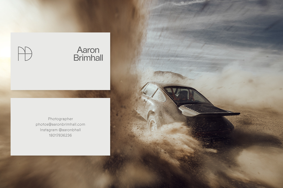





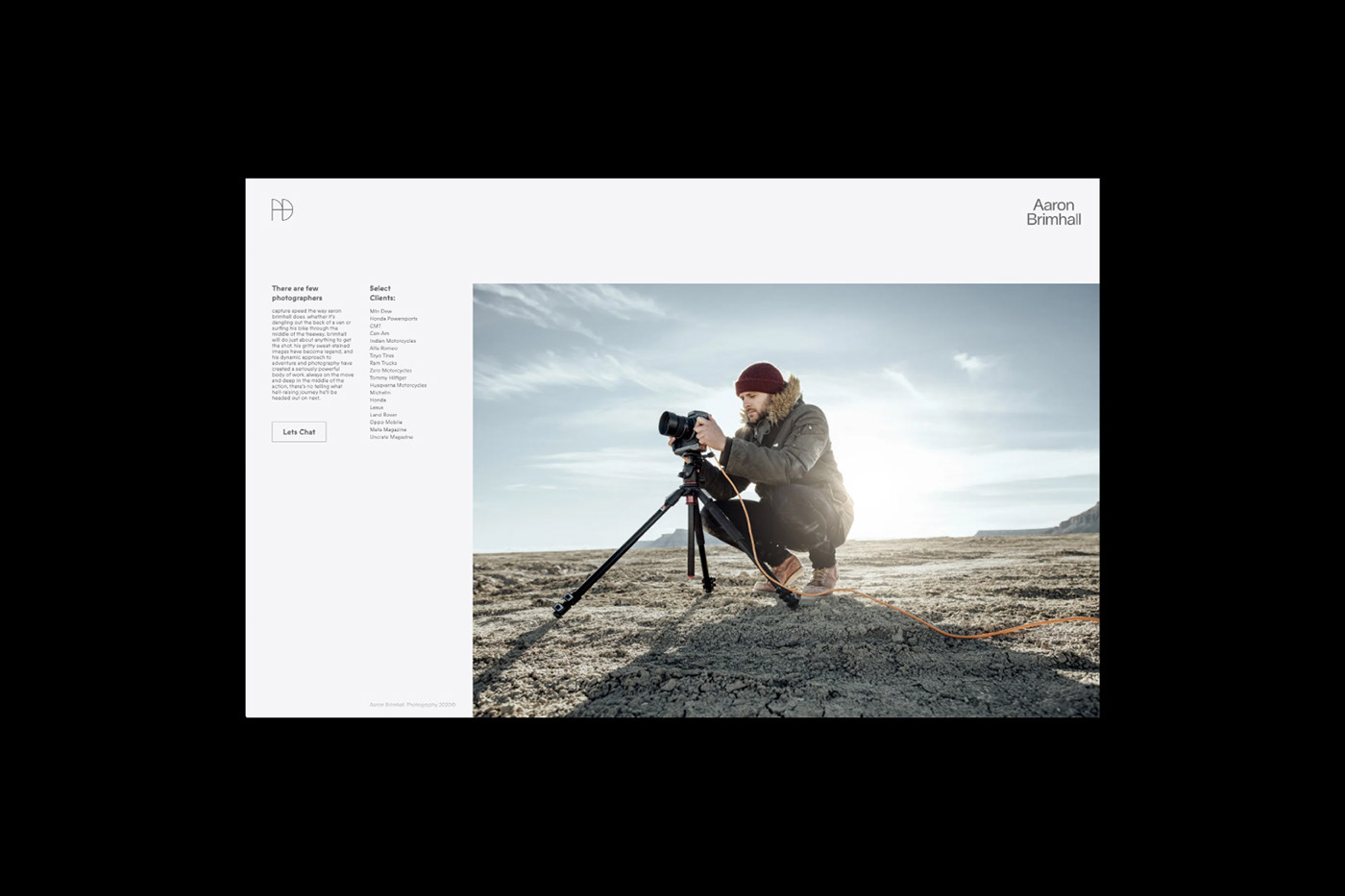
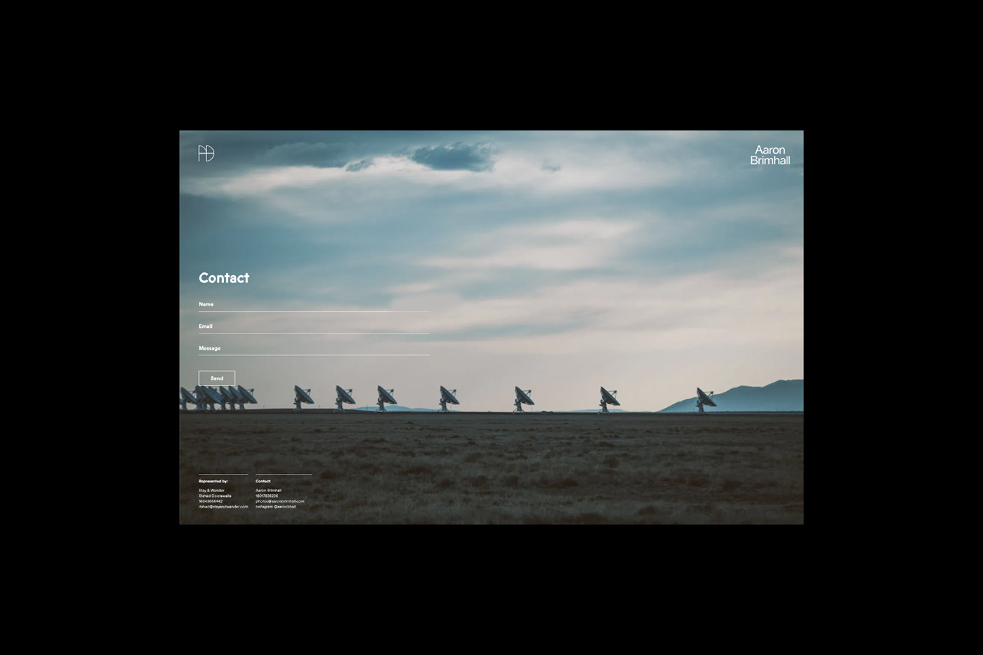


There are few photographers who capture speed the way Aaron Brimhall does. Aaron will do just about anything to get the shot, as evidenced by his incredible portfolio of elite clients. Despite Aaron’s powerful body of work, he never had a solid brand identity that matched his aesthetic. We had the opportunity to establish consistent branding that was subtle, yet strong.
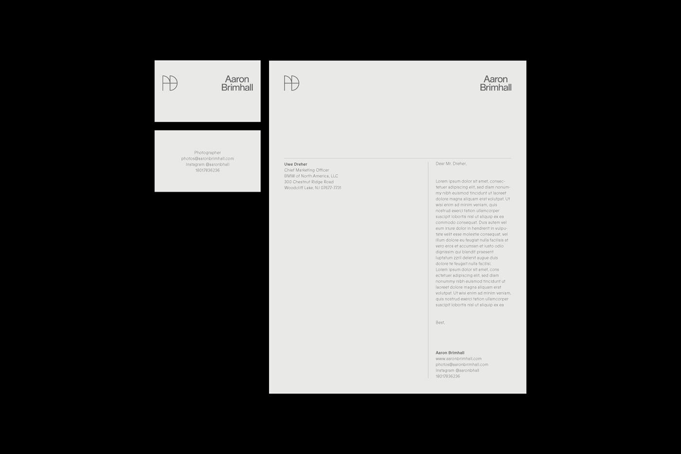
We designed something that lives in the background—a simple mark that communicates artistic maturity. The symbol is both an AB monogram and a representation of a camera viewfinder. The wordmark is set in Lausanne Regular and was chosen for its typographic exactness and exaggerated teardrop counter in the lowercase “a.” The symbol and wordmark work in tandem, complementing one another from a short distance but never closely paired.
The neutral color palette (not just black and white) doesn’t overshadow the intensity of his photographs or distract from his talent.
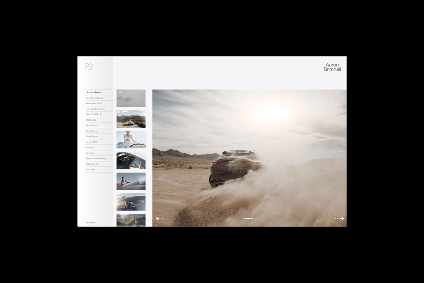
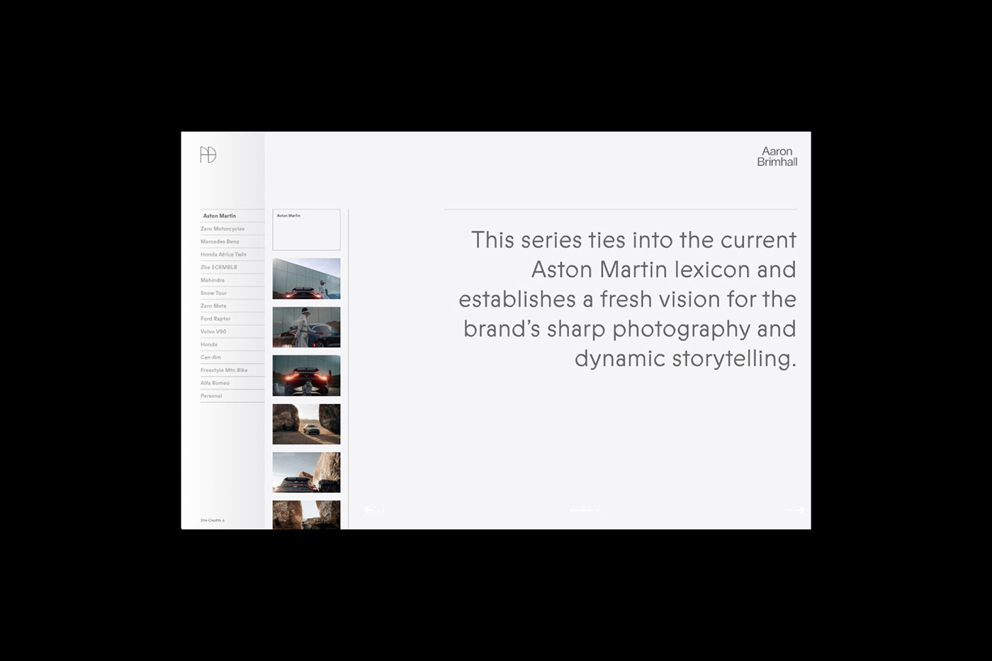
The website acts like a catalogue—it’s categorized with numbered photographs and short snippets that get to the heart of Aaron’s experience. His first-person narrative reads like a photo journal. The website is always full height, so the only scrolling done is in a vertical carousel, representative of a film strip.
Our overall approach allows the viewer to focus on Brimhall’s photographic style—his work shines through while our work intensifies its impact.
–
Photography: Aaron Brimhall
Website Development: Mitchell Barton
Motion: Jordan Dastrup
–


